

The 3L Framework: How to Write CTAs that Actually Convert for Your Hotel Tech Website
You’ve got a hotel tech buyer on your website exploring your solution.
Maybe they’re on a landing page, debating whether to register for your next webinar.
Or they just read your latest customer story and are keen on a demo because your tech sounds like it’ll solve all of a hotelier’s problems.
Or, or, or…
In all these situations, site visitors are on the edge of taking the next step: should they register? Request that demo? Sign the contract? Or bounce…?
That’s when a call-to-action gently nudges interested prospects to make a move.
But not all calls-to-action are created equal.
Some CTAs get people excited to click. Others bore, confuse or scare them off.
We clearly want scenario #1.
That’s why I’m revealing to you…
🥁🥁🥁 Drumroll…
My 3L framework for high-converting CTAs for hotel tech websites 🥳
Key takeaways:
- A CTA (call-to-action) is a short, action-oriented prompt. It moves readers from passive interest to an active next step e.g., booking a demo, downloading a guide, or signing up for a webinar.
- Avoid generic CTAs like “Submit” or “Learn more.” They create friction, confusion, and missed conversions. But small tweaks can go a long way.
- Use the 3L framework to optimize every CTA: Location (placement), Look (design), and Lingo (copy).
- A/B test one element at a time. Try different copy, colors, shapes, sizes and placements and treat CTA optimization as an ongoing practice.
But first, a short intro to CTAs. Or skip directly to the 3Ls.
What is a call-to-action, or CTA?
The name totally gives it away… Because yes, a call-to-action (CTA) is a prompt that directs the reader to take a specific next step.
It’s usually short, action-oriented text:
- Formatted as a link
- Highlighted in a button
- Placed in a banner
Common examples include “Book a demo”, “Download the guide”, or “Start your free trial.”
You’ll find them everywhere: on a website’s home page, on landing pages, in emails or in other pieces of content.
What is the role of a CTA?
CTAs are a bridge between a potential buyer’s interest in your solution and a meaningful interaction with your business.
In other words: Its job is to move a hotelier further along their buying journey and turn passive content consumption into an active step toward becoming a lead or customer.
For that to work, your CTA needs to do three things:
- Tell the reader exactly what to do
- Explain what they’ll get in return
- Make that action feel easy and worthwhile
The problem with lackluster CTAs
You’ve seen these CTAs…
“Subscribe”
“Create account”
“Sign up”
“Contact sales”
“Learn more”
Heck, I’m guilty of using them, too. Because they’re easy, relevant and they look like they’ll do the job.
But in reality, they’re like that colleague who shows up and leaves right on time and does the bare minimum to keep their job. Not a lick more. We all know one of those.
None of the above CTA examples are horrible or wrong or will earn you a one-star review on HotelTechReport.
But they could be better. Waaaaaay better. We’re talking several hundred percent better. And yes, I found data to back that up.
Now maybe you’re wondering: “But I want my reader to contact sales. Why shouldn’t I just say so?”
The same goes for “sign up” or “create account.” You’re saying that because it’s the next step you want people to take.
Unfortunately, these simple, boring CTAs…
- Add unnecessary friction: When I read “Contact sales”, I immediately dread an endless stream of emails. I just want to get a person on the line to answer my questions. And maybe I don’t want to be “sold to” right now, but just have some questions. No, thanks, bye.
(I’m not saying that’s how it goes at your company or that your sales team is pushy. I’m saying that’s the subconscious response many people have to the phrase “Contact sales”.)
- Leave readers confused: “What happens after I create an account? Is it free? For how long? Do you want payment information right away? And will I get to test all the features? I’m not sure about this. Now the engineering manager is calling me back about that burst pipe on the fifth floor. Gotta go,” thinks the GM.
- Don’t create enough urgency: “What if I don’t sign up now? I can always do it tomorrow,” thinks the Director of Rooms. And then tomorrow, they forget all about you because the hotel is overbooked by 53 rooms and they need to deal with that first.
The good news: You can easily avoid these issues if you apply my 3L-framework for high-converting CTAs.
How to turn your CTAs into click-magnets with the 3L framework
The three Ls stand for:
- Location – Where is your CTA on the page?
- Look – How does it look?
- Lingo – What does it say?
Optimize each of the three Ls and watch conversion climb.
Here’s how.
L for Location: Where to put your CTAs, so your readers see them
Here’s what to consider with CTA placement depending on the page or content you’re working on.
CTAs on your homepage and landing pages
You can start by following the common practice of having a “Book demo” button in your home page hero image. That’s perfect for people who have researched your hotel tech solution and are beginning to narrow down their shortlist.
Here’s how Mews does it 👇
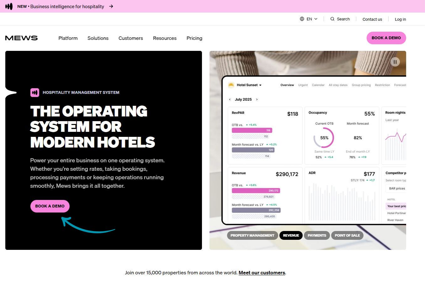
This approach also works for landing pages that offer your latest hotel tech buyer guide, industry data report or webinar registration.
If someone already knows they want your content, a button at the top allows them to opt in quickly. No need to force them to scroll all the way down the page.
But say it’s someone’s first time visiting your homepage or hearing about your offer. They need to know more before they continue.
See the click as an investment. People are choosing to give you their information, spend time consuming more of your content or speaking to sales.
Make this investment worthwhile.
What are they going to gain from it:
- Free market data?
- A personalized solution idea for their problem?
- Maybe they’ll learn a way to save time or money, generate more revenue or reduce chargebacks…
Whatever they get, the perceived value must be higher than the perceived cost of clicking your CTA.
So give them enough relevant information about your offer to make the click a no-brainer.
That means a CTA could follow halfway down the page. And appear again at the very end.
This example highlights how a CTA at the end of the page actually did much better – 304% better. I know, it’s not hotel tech-related. But the data still counts.
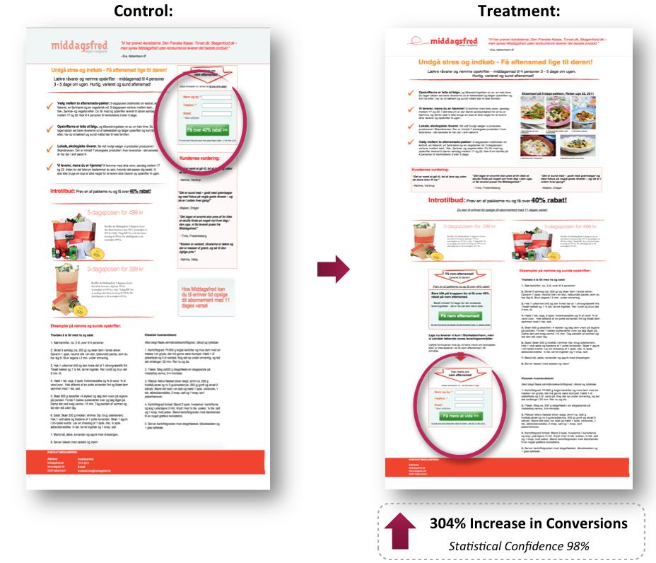
Image source: https://marketingexperiments.com/email-marketing/email-optimization-a-single-word-change-results-in-a-90-lift-in-sign-ups
The point is: Look at what makes sense on your page and place your CTAs accordingly.
CTAs in customer stories, articles and other long-form content
Place a contextual CTA halfway through to catch readers when their interest is at its peak.
- In a guide on driving direct bookings, that could be: “See how the Busy Boutique Hotel in Berlin increased direct bookings by 45% with our platform.” This would take them to the case study.
- A CTA within a customer story about how the Clean Cabins in Cape Town saved hundreds of housekeeping hours might say: “Discover how much time your team could save.” That could take them to a calculator to determine their time savings.
Include a CTA at the end of long-form content as well. It’ll reach the people who make it all the way through. And they’re often your most qualified prospects.
CTAs on demo and pricing pages
These are high-intent pages where visitors are close to a decision. Make your CTA count!
First, replace static contact forms with embedded booking calendars. That way your prospects can get serious and book a call. According to Unbounce, this alone can increase demo requests by 30%.
Next – you probably guessed it –encourage form completion with an enticing CTA. That could be something like “Book my personal call”, “Hook me up with an expert” or “I want to talk details”.
Of course, the text needs to match your brand voice. And some of these examples may be too informal for your company.
But you get my point: For the love of RevPAR, pick something other than “Submit form.”
L for Look: How to design your CTAs to grab readers’ attention
The subhead already gives it away, doesn’t it? Your CTA needs to stand out from the rest of the page.
The bare minimum is to use your standard hyperlink highlight. Depending on the context, that may be enough or the most appropriate design choice.
But important CTAs deserve a bit more help, so they can do their job.
Here are five ways to dress CTAs for success:
- Format CTAs as buttons: This breaks up the content’s visual flow of an article because buttons stand out from text and images. Sixth City Marketing found that button-shaped CTAs get around 45% more clicks than plain text links.
- Choose the right color: Play around with the color, since that can make a huge difference. Performable found that a red button outperformed a green button by 21%.
- Yes, size matters: The button should be big enough to see easily without being obnoxiously large. Make sure it’s also thumb-friendly on mobile devices. If in doubt, go bigger. A/B tests show larger CTAs can boost clicks by up to 90%.
- Keep it clean: Add enough padding between the button and surrounding elements. White space is your friend here because it can make buttons pop even more and lift conversions by a staggering 232%.
- One CTA per page: Pick only one next step per page, especially on landing pages, blog posts and demo pages. The goal needs to be clear. What one thing should readers do next? Avoid confusing them with a bunch of options because then they’ll just end up doing nothing.
Your home page is the only exception: Here, several CTAs can make sense. See the home page as a welcoming hotel lobby from where readers can access whatever space they want.
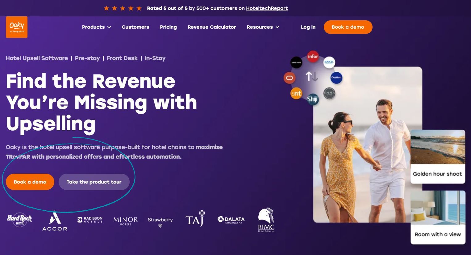
While there are two CTAs competing for attention, “Book a demo” is optimized to stand out with its bright orange color.
- Add click-trigger copy under your button: That’s the fancy way of telling you to add a supporting subline if needed (e.g., “No commitment. Cancel anytime.” or “Trusted by over 5,000 hoteliers worldwide.”).
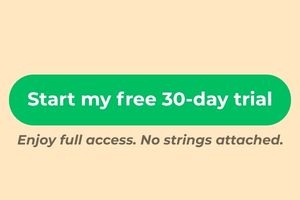
This reminds the reader that they get full access for free for 30 days which highlights the trial’s value.
Adding “No strings attached.” aims to reduce friction and eliminate worries like “Does this mean I’ll be forced into a paid plan after the trial?”
L for Lingo: What your CTAs should say to get more clicks
Now, for my favorite part… CTA button copy. Let the following six points inspire you, so you never have to fall back on “Learn more” or “Submit form” again.
- Use first-person language: A simple shift from “Start your free 30-day trial” to “Start my free 30-day trial” increased clicks by 90% because it creates a sense of ownership. Other ways to apply this include: “Show me my ROI” or “Get my custom demo.”
- Switch from passive to active words: Use active verbs to make the CTA more engaging. For example, you can go from “Submit” or “Download” to “Claim my spot” or “Get my free report now.” That can boost conversions by up to 121%.
- Be specific and lead with the benefits: Tie the CTA to a concrete outcome relevant to hoteliers, such as “See how much time housekeeping will save” or “Discover what’s costing your property revenue.” Marketers also call this CTV, call-to-value. Show what’s in it for them!
- Match the phrase to the reader’s stage of awareness: A first-time visitor needs lower-commitment language (“Explore the platform”). A returning visitor who has already engaged with your content is ready for “Talk to a specialist.”
- Create urgency without being pushy: Frame urgency around business outcomes rather than countdown timers. After all, you’re not a discount shoe store during Black Week. Something like “Get set up before peak season” speaks to a real operational concern for hoteliers and hints at a strong benefit – helpful new tech being ready for the busiest time of year.
- Keep it short: CTA copy should be clear, short and punchy. Aim for two to six words on the button. That being said, they can be a bit longer if you’re communicating a particular benefit or outcome.
Two bonus tips just for you
- Make sure your CTA works: This should be obvious. But if something breaks, people are unlikely to give you another chance.
- Keep testing: Every audience is different. Try different placements, colors, shapes, sizes and copy. Yes, it takes time but it will further boost your conversions.
Conclusion: CTAs are small but mighty, so give them the attention they deserve
Now that you know all about my 3L framework, you also know that high-converting CTAs aren’t sorcery or luck.
They’re a mix of know-how and ongoing testing. And now that you’re armed with the know-how, you can start testing and optimizing.
Work on one L at a time.
- Audit your current CTAs for location: Are they showing up at the moments of highest reader intent?
- Then check the look. Does your button stand out, or does it blend into the page?
- Finally, sharpen the lingo. Ditch the generic text and write copy that speaks directly to the hotelier reading it.
Small changes compound. A better placement here, a first-person tweak there, a splash of contrasting color, and suddenly your CTAs are doing the heavy lifting they were always meant to do.
Now, over to you. Give your CTAs the glow-up they deserve ✨
FAQs about writing high-converting CTAs
Q1. How many CTAs should I have on a page?
As a rule, stick to one primary CTA per page, especially on landing pages, blog posts, and demo pages.
Multiple CTAs compete for attention and can lead to decision paralysis, where the visitor ends up doing nothing at all. The exception is your homepage. It serves multiple audiences and can accommodate a few different CTAs pointing to different areas of your site.
2. Should my CTA button color match my brand colors?
Not necessarily. The most important thing is contrast.
Your button needs to stand out from the surrounding page, not blend into it. If your key brand color is orange, a button of the same color will disappear. Instead, test a contrasting color (ideally one from your brand color scheme) against your background and measure the impact. Even a simple color swap has been shown to move conversions up.
3. What’s the difference between a CTA and a CTV?
A CTA (call-to-action) tells the reader what to do: “Download the guide.” A CTV (call-to-value) tells them what they’ll get out of it: “Get my free guide to reducing chargebacks.” In practice, the best CTAs are really CTVs in disguise. They lead with the benefit, not the action. For hotel tech marketers, leading with outcomes that resonate with hoteliers (time saved, revenue gained, costs cut) will almost always outperform generic action labels.
4. How do I know if my CTAs are actually working?
Track click-through rate (CTR) to see how many people who saw the CTA actually clicked it. Also look at conversion rate, meaning how many of those clicks led to the desired outcome (a demo booked, a form filled, a guide downloaded). Most website analytics tools like Google Analytics or HubSpot will show you this data. If a CTA has high traffic but low CTR, the problem is likely copy or design. If CTR is healthy but conversions are low, the issue is probably what happens after the click e.g., the landing page or form itself.
5. How often should I update or test my CTAs?
There’s no fixed schedule, but a good rule of thumb is to review CTAs whenever you notice conversion rates plateauing or dropping. Beyond that, run A/B tests regularly. Change one element at a time (copy, color, placement, size) and measure the impact over at least one to two full weeks to get statistically meaningful results. What works today may not work in six months as your audience evolves, so treat CTA optimization as an ongoing practice rather than a one-time fix.




Leave A Comment