

Your Pricing Page Is Losing You Leads. Here’s Why (and How to Fix It)
Think your pricing page is just a place to list your rates?
Think again.
Yes, hoteliers go there to get a sense of your numbers. But a pricing page is doing a lot more heavy lifting than that. Or at least it should be.
Done well, it:
- Reassures hesitant buyers that they’re in the right place
- Reminds them why your solution is worth the investment
- Gently nudges them to take the next step: request a demo, start a free trial, or reach out to you.
Done badly, a pricing page kills momentum when a prospect is just about to contact you.
But that doesn’t have to happen on your website because you’re about to know better.
Here are the five most common pricing page mistakes I see hotel tech companies make, and exactly how to fix them.
Key takeaways:
- Your pricing page is a conversion page, not just a price list. It should reassure hesitant prospects, reinforce your value, and move readers closer to reaching out.
- Hiding your pricing costs you shortlist spots. Buyers do the bulk of their research before ever speaking to sales. If your pricing is missing, you risk losing leads to the competition.
- Every element of your pricing page should pull its weight. Your headline, CTAs, social proof and FAQ section all have a job to do. Generic copy and empty space are silent conversion killers.
- Small fixes compound. You don’t need a full redesign to see results. A value-driven headline, sharper CTA copy, one strong testimonial and an honest FAQ section can meaningfully move the needle.
What’s the point of a pricing page?
Before diving into the mistakes, let’s get clear on what a pricing page is actually for.
Now you’re probably thinking: “D-uh, to show my pricing.”
And you’re right.
Or, if you’re one of the many hotel tech companies that doesn’t publish rates, your pricing page exists to get people to reach out and get a custom quote.
Either way, that makes your pricing page a… conversion page. Its job is to convert site visitors from curious prospects to engaged leads.
It’s also a chance to:
- Remind hoteliers of the valuable outcomes they’ll gain from your solution
- Show them there’s a plan that fits their property
- Lead them gently yet confidently to the next step – getting serious and reaching out to you
In short: A pricing page is way more than a price list.
So let’s make sure yours is working as hard as it can to increase demo requests, sign-ups or contact requests from hoteliers.
5 Common mistakes hotel tech companies make on their pricing page and how to fix them
Each of these mistakes acts like a speedbump, or worse, a total roadblock on a hotelier’s way to getting in touch with you. Here’s how to clear them and pave a smooth way for your prospects.
Mistake #1: Hiding or being vague about pricing
During my research for this piece, I noticed that a lot of hotel tech companies don’t reveal their pricing at all. And I get it.
Many solutions are complex, with multiple modules, add-ons and property-type variables that make it feel near-impossible to show a clean, easy-to-understand price overview.
And of course, the last thing you want to do, is confuse your prospects.
So it feels simpler to let sales draw up a personalised quote for each enquiry.
The problem with this approach: Hidden pricing is a big friction point.
According to 6Sense’s B2B Buyer Experience Report, 83% of buyers define their requirements before ever speaking to sales.
They do their homework independently, and pricing is a big part of that research. That’s why Search volumes for “pricing” are 9x higher than for terms like “alternatives”, “demos” or “reviews”.
Capgemini research reinforces this. They found that price transparency plays a critical role in brand credibility.
The result: If your pricing is hidden, many hoteliers simply won’t shortlist you. They’ll move on to a competitor who gives them something concrete to work with.
What to do instead:
- Give prospects at least a ballpark. Event a rough pricing overview helps them self-(dis)qualify and avoids sticker shock on the call.
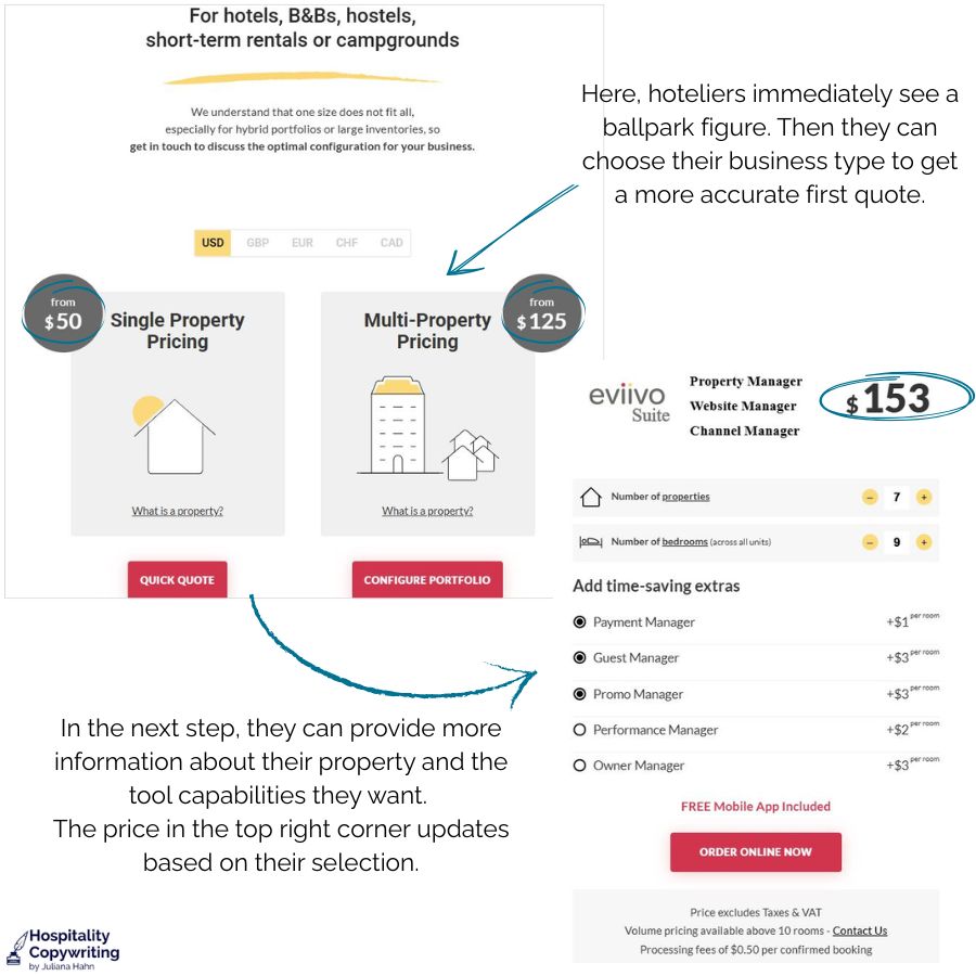
- Consider a pricing calculator if your solution is too complex for a standard pricing table. Let prospects input their property size and select the modules they need.Eviivo does this well with their simple calculator. And at the end, they ask for contact details to draw in their prospect.
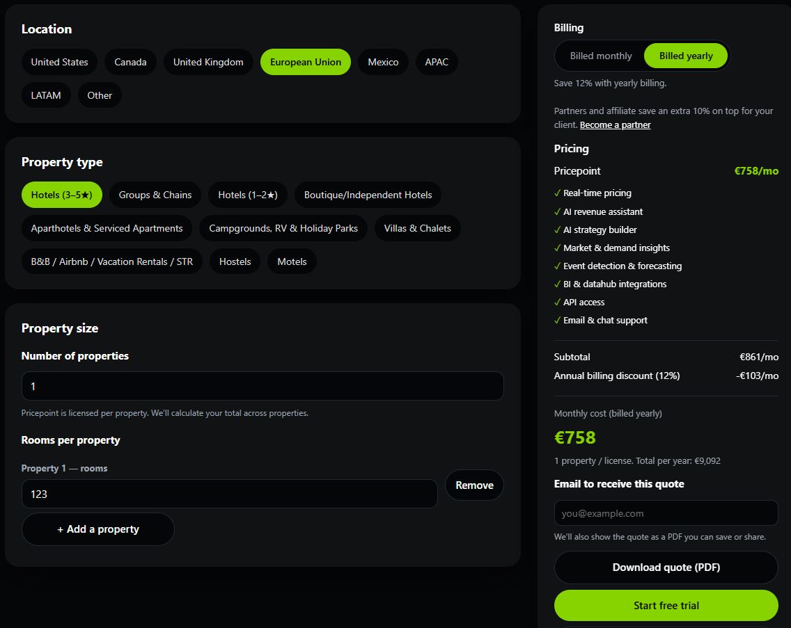
Pricepoint.co has a similar approach but different design.
- Acknowledge that the price shown isn’t final. Say something like “Get an idea of costs here. We’ll build your personalised quote on the call.” That gives buyers something concrete while keeping the door open for a more tailored quote during your conversation.
- If you’re feeling ambitious: You know how some hotel websites use chatbots to guide guests toward the right room? A similar experience for your pricing page could be a fun and easy way to handle a complex offering. (If you try this, please let me know — I’d love to feature it as an example here 😊)
Mistake #2: Missing or weak value proposition
Isn’t a pricing page supposed to be, well, all about pricing?
Yes and no. Sure, hoteliers want to see the numbers. But they’re also silently asking: “Is this the right solution for me? Is it worth it?”
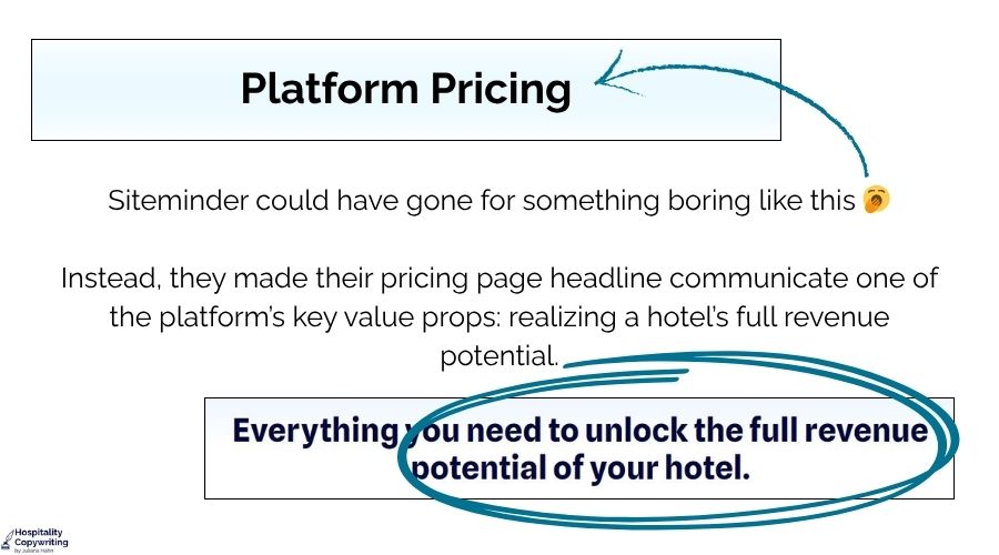
If your pricing page opens with “Pricing” as the headline and jumps straight into a table or a contact form, you’re answering one question but ignoring the other. You’re throwing numbers at your reader, but are missing a valuable chance to reassure readers that they’re in the right place.
What to do instead:
- First, think about what your reader wants from your offer right now. What’s unique about your tech solution that hoteliers want so badly and won’t get from your competitors?
- If you’re not sure, ask your existing clients. They’ll tell you in their own words, which are usually much better than anything marketing comes up with.
- Spice up your headline. Make it lead with the outcome, not the product.
- For example, an upselling platform might open with: “Give your front desk the straightforward tool that makes upselling quick, fun and easy.”
That’s not asking anyone to spend money. It’s showing them what life looks like on the other side.
- For example, an upselling platform might open with: “Give your front desk the straightforward tool that makes upselling quick, fun and easy.”
- Add a subhead that addresses a common worry before hoteliers even have to voice it.
- Let’s stay with our example for upselling software: “You want consistent upsell revenue and five-star reviews without piling more onto your team’s full plate. Get it now with upselling software your staff and guests will love.”
See the difference in headlines in the example below. Siteminde did a great job highlighting the platform’s value in the pricing page headline.
Mistake #3: Weak or generic CTAs on the pricing page
Ideally people will get in touch or book a demo after seeing your pricing page. Nudge them in that direction with a strong CTA.
Too often I see boring buttons like:
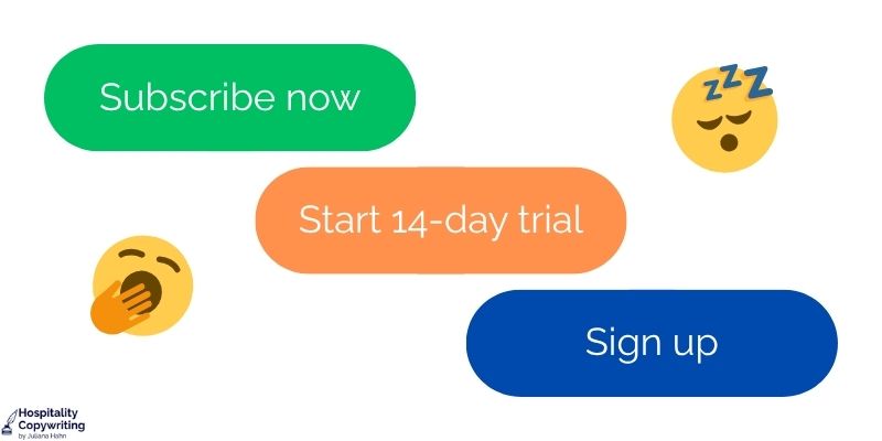
They’re not terrible. But they’re doing the bare minimum and don’t communicate the value hoteliers will get. What’s worse, they introduce friction. That’s why they convert 31% worse than specific, value-focused copy.
For example, “Subscribe now” raises an immediate question: “Do I have to pay right away? What am I actually signing up for?”
That kind of confusion, even a tiny flicker of it, is enough to make busy hoteliers decide to “check back later”, after they dealt with the complaining guest in room 216. And we all know what that means. 👋👋👋
What to do instead:
- Use a call-to-value (CTV). This type of CTA that leads with what the hotelier will get, not just what they’re about to do.
- Sticking with the upselling platform example: “Start upselling the easy way” is short, punchy and communicates value instantly. No ambiguity, no friction.
- Create different CTVs for each pricing tier to reflect what sets them apart from each other
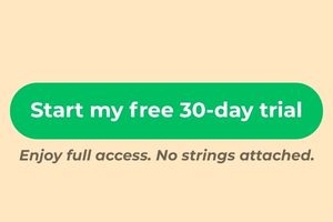
- Add click trigger copy below the button to emphasize that it’s a free trial: “Try it free for 14-days. No strings attached.” Here’s how that could look.
Mistake #4: Missing social proof and trust signals
Your pricing page is asking hoteliers to take a step toward committing to your solution. Reminding them of your value proposition (see mistake #2) is a start.
But don’t stop there.
Too many pricing pages end after the pricing table and the CTA. This leaves the reader hanging.
There’s no reassurance, no evidence, no reason to feel confident about taking the next step. And if they leave with lingering doubts, there’s a real chance they’re gone for good.
As Share One puts it: “A pricing page without proof can feel like walking into a luxury showroom where nobody makes eye contact.” Ouch.
What to do instead:
- Add social proof that ties directly back to your value proposition.
- Keep it short, specific and use numbers where possible. A vague “We love this tool!” quote from a GM won’t do much.
- Ideally choose testimonials that focus on the platform’s ease of use and its ROI – two of the biggest concerns a hotelier has at this stage
- For the upselling platform example, we’d want something like this: “We increased ancillary revenue by 18% in the first three months, and the team picked it up in a day.”
- Stick with two to three short quotes to avoid overcluttering the page
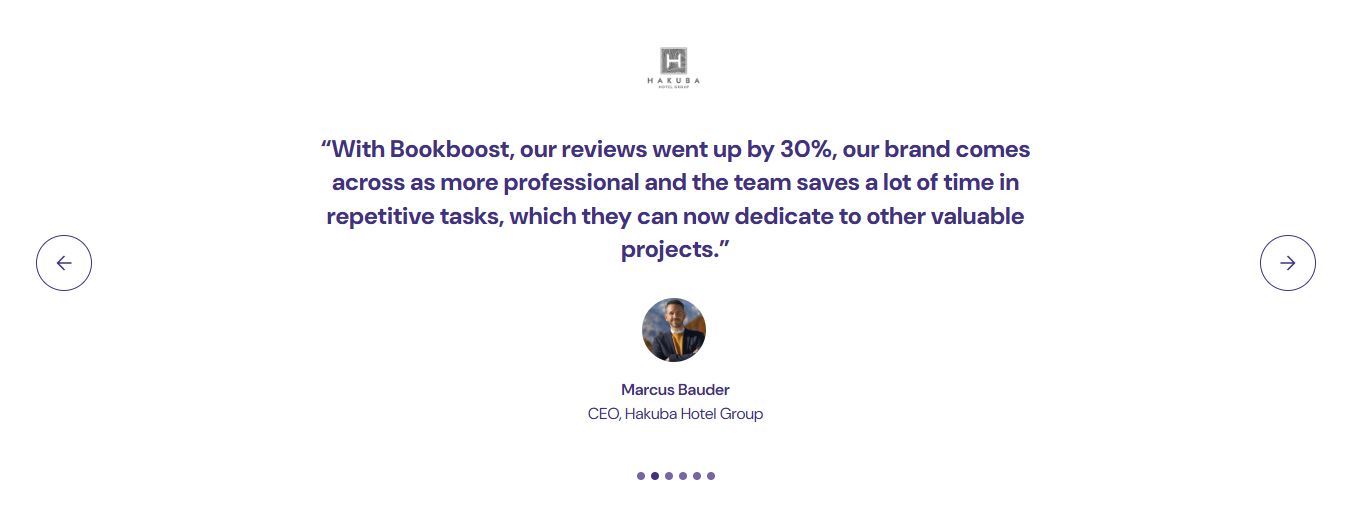
Bookboost does a great job here. They included a slider of five testimonials on their pricing page. Each one reflects either the tool’s value, its ROI or both.
Mistake #5: No FAQ section to handle objections
Even after a strong value proposition, clear pricing and compelling social proof, hoteliers will still have questions.
That’s not a sign that your pricing page is weak. It’s just how sceptical hoteliers go about their B2B purchase.
The mistake is leaving those questions unanswered. Because unaddressed objections tend to win.
The prospect clicks away, convinces themselves they’ll “come back later”. And let’s be honest. When’s the last time you “came back”? 🤔
What to do instead:
- Include a brief FAQ section at the end of your pricing page. Use questions actual prospects have asked, e.g., during demo calls or, if you have it, through your website chat.
- For hotel tech, the ones that come up most often tend to be:
- How long does setup or migration take?
- What integrations are included, and at which plan level?
- Is there training for the team? What if they need more support?
- What does ongoing support look like, and when is it available?
- What happens if we decide to cancel?
- Provide concise, honest and clear answers. You’re not trying to end every answer with a sales pitch. You want to show that you know your prospects’ concerns and take them seriously.
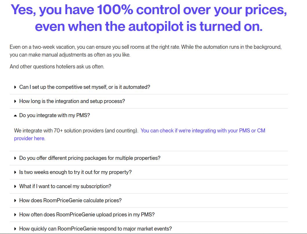
- Bonus tip: Don’t just use “FAQ” as the subheading. Use the most common question instead. Here’s how that could look: “What’s your ROI? …And other interesting questions you may have” is far more inviting than a generic header. And it signals that you’re ready to have a real conversation.
RoomPriceGenie sets a great example here.
Conclusion
Your pricing page gets some of your most qualified traffic. These are hoteliers who’ve already done their research, narrowed their options and are close to making a decision.
The last thing you want is to lose them to a friction point you could easily fix.
So go audit your pricing page against these five mistakes now. And no, you don’t have to overhaul everything at once.
Start with your headline. Then look at your CTA copy. Add one well-chosen testimonial. Build the FAQ section.
Each fix is small on its own. Together, they turn a passive price list into a high-converting page.
If you’d rather hand it off to an expert, I offer pricing page audits and rewrites for hotel tech companies — drop me a message and let’s take a look.
FAQs about how to optimize pricing pages
Q1. Should we publish our pricing even if our solution is complex?
Ideally yes, to the extent you can. Even a “starting from” figure, a pricing calculator or a transparent explanation of how pricing works gives prospects something to anchor to. The alternative is friction, and in the self-serve research phase, friction can cost you your spot on a hotelier’s shortlist.
Q2. How many CTAs should we have on our pricing page?
Stick to one primary CTA per pricing tier. Multiple competing buttons create decision paralysis. If you have three tiers, each gets one clear call-to-value. Add click-trigger copy underneath if needed to remove any last hesitation.
Q3. What kind of social proof works best on a pricing page?
Use quotes specific and outcome-led quotes. Vague praise doesn’t do much at this stage. Buyers are close to a decision and need evidence, not encouragement. Short quotes with real numbers (e.g., revenue lift, time saved, occupancy gained) from similar property types are most convincing.
Q4. Which questions should my FAQ section answer?
Focus on the objections that actually come up in your sales process, e.g., set-up time, integrations, support, training and cancellation terms are the usual suspects in hotel tech. If your sales team hears the same question three times, it belongs in your pricing page’s FAQ section.

Leave A Comment